Introduction
Dashboards are the heart of digital products. Whether it’s an analytics platform, SaaS tool, or admin panel, a well-designed dashboard empowers users with quick insights, smooth navigation, and delightful interactions. In 2025, dashboard design trends focus on clarity, minimalism, personalization, and dark mode aesthetics.
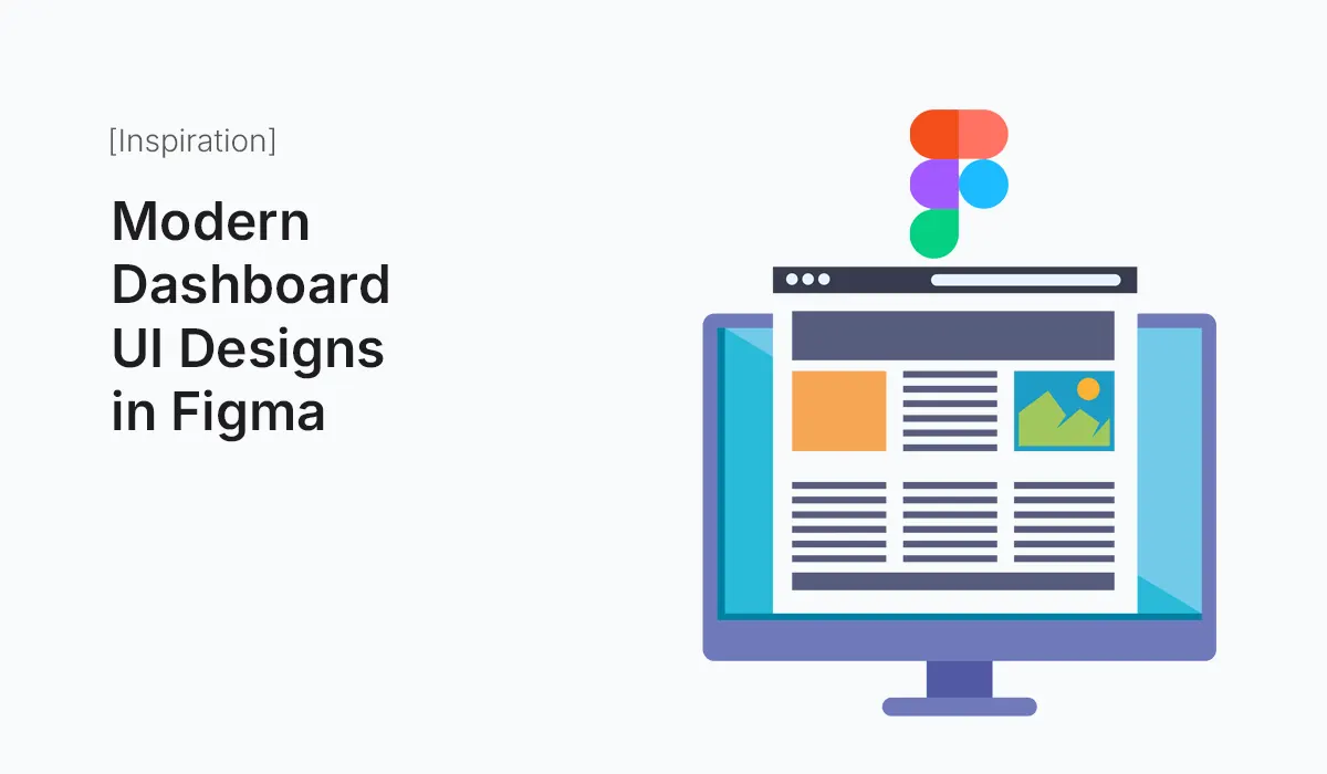
And the best part? With Figma, you can design modern dashboards faster, collaborate seamlessly, and explore design systems that bring order to complexity.
In this guide, we’ll walk through the principles of modern dashboard UI design in Figma, explore real-world trends, and share practical tips to build your own.
Why Dashboards Matter in UI Design
A dashboard is more than just a data display. It’s the control center where users make decisions. A modern dashboard should:
- Provide clarity – Users should instantly understand what’s most important.
- Enable actions – Quick access to features or tools reduces friction.
- Balance visuals & usability – Charts, icons, and typography must be easy to interpret.
- Scale across devices – Responsive dashboards for desktop, tablet, and mobile are now essential.
Key Elements of a Modern Dashboard UI
Navigation
- Vertical or horizontal sidebars with expandable menus.
- Collapsible navigation for small screens.
- Clear icons and labels to avoid confusion.
Data Visualization
- Use charts, graphs, and infographics.
- Line charts for trends, bar charts for comparisons, pie/donut charts for distribution.
- Integrate real-time updates if needed.
Typography & Colors
- Clean, readable fonts (e.g., Inter, Poppins, Roboto).
- Neutral background with accent highlights.
- Support for light and dark mode themes.
Widgets & Cards
- Modular card components for tasks, stats, or messages.
- Draggable or resizable widgets for personalization.
Responsiveness
- Use Figma’s Auto Layout for dynamic resizing.
- Apply constraints and grid systems.
Trends in Modern Dashboard UI (2025)
- Dark Mode by Default
Most dashboards now offer dark mode for reduced eye strain. - Minimal, Data-First Layouts
Less clutter, more focus on key metrics. - AI-Powered Widgets
Predictive suggestions and automation features integrated into dashboards. - Micro-Interactions
Hover states, transitions, and feedback animations make dashboards feel alive. - Customizable User Dashboards
Users can rearrange cards, choose themes, and personalize data views.
Designing a Dashboard in Figma: Step-by-Step
I: Define Goals
- What problem does the dashboard solve?
- Who are the users (managers, developers, marketers)?
II: Wireframe the Layout
- Create low-fidelity wireframes for navigation, charts, and widgets.
- Focus on information hierarchy before styling.
III: Build Components
- Buttons, cards, tables, and charts as reusable components.
- Use Figma Variants for multiple states (hover, active, disabled).
IV: Apply Grids & Auto Layout
- Use an 8px grid system for spacing.
- Apply Auto Layout for responsiveness.
V: Add Data Visualization
- Use Figma plugins like Chart, Datavizer, or Google Sheets Sync.
- Keep charts simple and readable.
VI: Add Interactions
- Use Figma Prototyping to connect navigation and widgets.
- Include hover effects and transitions.
VII: Test & Iterate
- Share prototypes with teammates.
- Collect feedback and refine usability.
Examples of Modern Dashboard UI in Figma
- Analytics Dashboard: KPIs, graphs, and revenue metrics in card format.
- E-commerce Dashboard: Sales, orders, customer tracking, inventory.
- SaaS Dashboard: Subscriptions, churn rate, user activity.
- Admin Panel: User management, permissions, system monitoring.
You can explore community files in Figma Community → Dashboards to find templates and inspiration.
Tips for Better Dashboard Design in Figma
- Don’t overload users with data – Prioritize top metrics.
- Use consistent icon packs – Feather, Untitled UI, or Material icons.
- Make use of styles – Color styles, text styles, and grid styles ensure consistency.
- Keep it modular – Dashboards evolve; modular components make scaling easier.
- Test in real context – Preview on different screens to ensure usability.
Conclusion
Modern dashboards are all about clarity, customization, and interactivity. With Figma’s collaborative features, you can design, test, and ship dashboards faster than ever before.
Whether you’re building for SaaS, analytics, or admin tools, following these principles will help you deliver a dashboard that users love in 2025 and beyond.
Start crafting your own Modern Dashboard UI Designs in Figma today and transform complex data into intuitive, user-friendly experiences.