Introduction
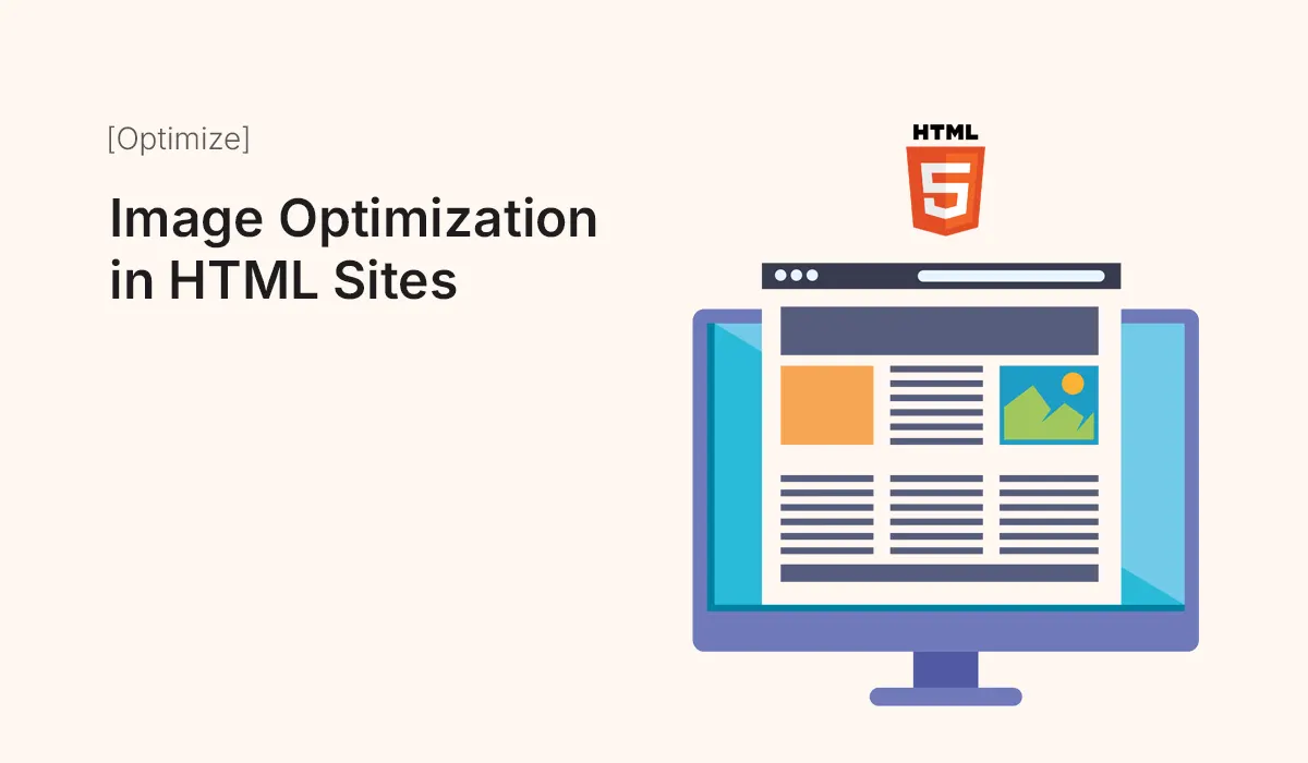
Images are an essential part of modern websites. They make content more engaging, visually appealing, and easier to understand. However, images also account for the majority of a site’s load time. Poorly optimized images can slow down websites, harm user experience, and negatively impact search engine rankings.
In this guide, we’ll explore image optimization techniques for HTML sites to ensure your website loads faster, ranks better, and delivers a smooth user experience.
Why Image Optimization Matters
- Improves Website Speed – Smaller file sizes load faster.
- Boosts SEO Rankings – Google prioritizes fast-loading sites.
- Enhances Mobile Experience – Optimized images consume less data.
- Increases User Retention – Visitors stay longer when pages load quickly.
- Saves Bandwidth and Hosting Costs – Smaller images mean lower server load.
Step 1: Choosing the Right Image Format
- JPEG/JPG – Best for photos and detailed images.
- PNG – Great for graphics, logos, and transparency.
- GIF – Suitable for simple animations.
- WebP – Modern format with excellent compression and quality.
- SVG – Best for icons, logos, and vector graphics (scalable without losing quality).
Pro Tip: Use WebP whenever possible for modern browsers, and provide fallbacks.
Step 2: Compressing Images
- Lossy Compression – Reduces size by removing some details (e.g., TinyPNG, JPEGmini).
- Lossless Compression – Keeps quality intact but still reduces size (e.g., ImageOptim).
Tools for Compression:
- TinyPNG / TinyJPG
- Squoosh by Google
- ShortPixel (plugin for WordPress)
- ImageMagick (command-line tool)
Step 3: Using Responsive Images in HTML
<img src="image.jpg"
     srcset="image-480w.jpg 480w, image-800w.jpg 800w, image-1200w.jpg 1200w"
     sizes="(max-width: 600px) 480px, (max-width: 900px) 800px, 1200px"
     alt="Optimized responsive image">
This ensures the browser picks the right image size based on the device screen.
Step 4: Lazy Loading Images
Lazy loading delays loading images until they are visible on the screen.
<img src="image.jpg" loading="lazy" alt="Lazy loaded image">
Saves bandwidth and improves initial page speed.
Step 5: Using Image Sprites
Combine multiple small images (icons, buttons) into one large image and use CSS to display portions. This reduces HTTP requests.
.icon {
  background: url("sprite.png") no-repeat;
}
.icon-home {
  background-position: 0 0;
}
.icon-about {
  background-position: -50px 0;
}
Step 6: Optimize with CDN and Caching
- Use a Content Delivery Network (CDN) like Cloudflare or BunnyCDN for faster delivery.
- Add caching headers (
Cache-Control) to reuse images without reloading.
Step 7: Automating Image Optimization
- Build Tools: Gulp, Webpack, or Grunt with image optimization plugins.
- CMS Plugins: Smush, ShortPixel, or Optimole (for WordPress).
- Hosting Features: Some hosts (like Netlify or Vercel) automatically optimize images.
Common Mistakes in Image Optimization
- Uploading full-size images without resizing.
- Using PNG for photos instead of JPEG.
- Forgetting to set
altattributes for SEO. - Ignoring mobile optimization.
- Over-compressing images, making them blurry.
Best Practices for HTML Sites
- Use responsive images (
srcset&sizes). - Always set alt text for accessibility and SEO.
- Compress images before uploading.
- Enable lazy loading.
- Prefer WebP and SVG where possible.
- Deliver images via CDN for global performance.
Conclusion
Image optimization is one of the easiest and most impactful ways to boost website performance and SEO. By choosing the right format, compressing images, and applying responsive techniques, you can create HTML sites that load quickly and provide an excellent user experience across all devices.
Optimize your images today and make your HTML site faster, SEO-friendly, and more engaging for every visitor!