Introduction
When designing modern digital products, consistency is key. From buttons to navigation bars, reusing design elements saves time, reduces errors, and maintains a polished user experience. This is where component libraries in Figma come in.
Figma makes it easy to create, manage, and share component libraries across teams. Whether you’re working solo or with a large design team, a well-structured component library becomes your single source of truth.
In this guide, we’ll break down how to create component libraries in Figma, best practices, and tips to make your workflow faster and more scalable.
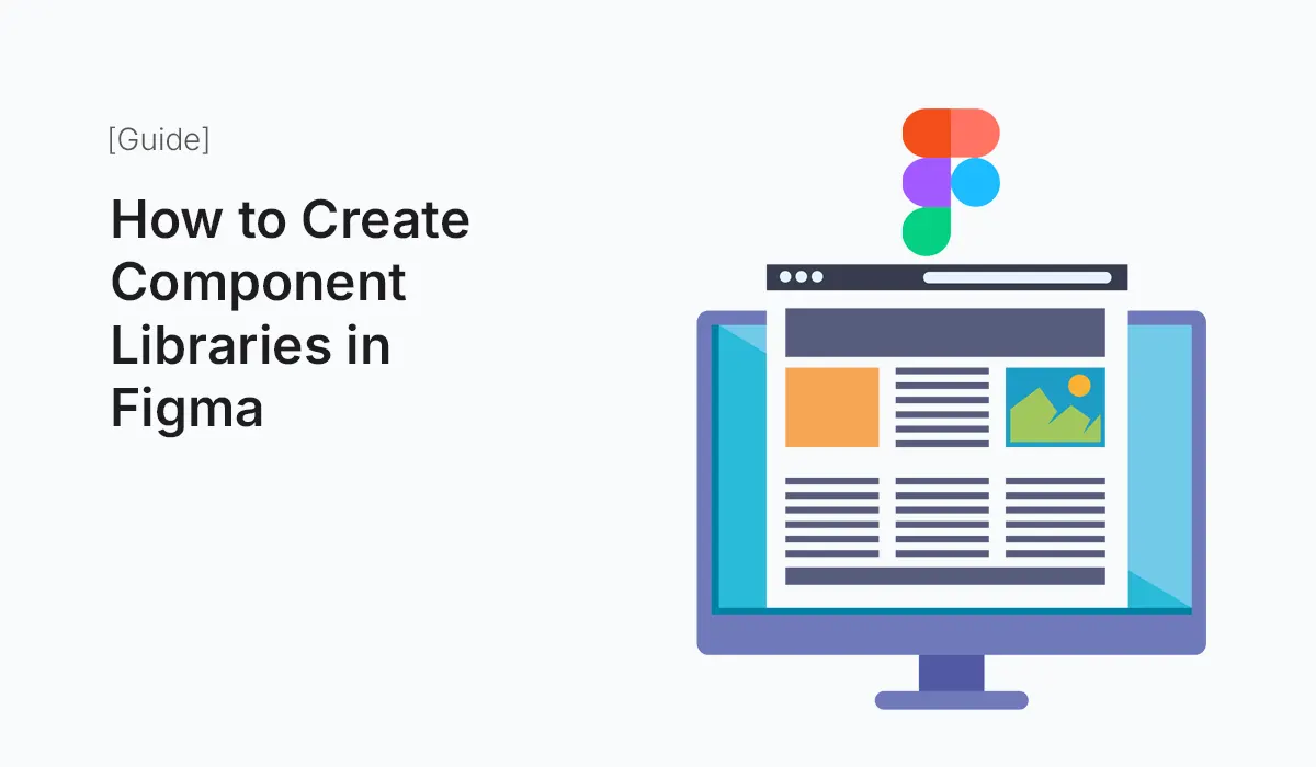
What Are Component Libraries in Figma?
A component library in Figma is a collection of reusable design elements (components) such as:
- Buttons
- Input fields
- Cards
- Navigation bars
- Icons
- Layout grids
Instead of recreating elements from scratch, designers simply reuse and modify components, ensuring consistency across multiple screens and projects.
Benefits of Using Component Libraries
- Consistency Across Projects
All screens use the same design language. - Faster Design Workflow
Build new pages quickly with drag-and-drop components. - Scalability
Update a component once, and changes reflect everywhere. - Collaboration Friendly
Designers, developers, and stakeholders share a unified system. - Version Control
Prevents duplication and keeps designs aligned with brand guidelines.
Step-by-Step Guide: Creating Component Libraries in Figma
I: Plan Your Design System
Before creating components, define:
- Brand colors
- Typography system (headings, body text, captions)
- Spacing and grid system
- Icon style (outline, filled, duotone)
II: Create a New Figma File for Your Library
- Open Figma → New File
- Name it something clear like: UI Component Library or Design System v1
III: Build Components
Start designing basic UI elements:
- Buttons: Primary, Secondary, Ghost, Disabled
- Form Elements: Text fields, dropdowns, toggles, checkboxes
- Cards: Product cards, dashboard widgets, profile cards
- Navigation: Sidebars, tabs, top bars
Use Auto Layout to ensure components resize properly.
IV: Organize Components
- Group related items into Frames
- Name components clearly:
Button / Primary / LargeInput / Text / With Icon
- Use Variants to manage multiple states (hover, pressed, disabled).
V: Publish as a Library
- Go to Assets → Library → Publish
- Enable the file as a Team Library
- Now, anyone in your team can use the components across projects.
VI: Keep It Updated
- Add new components as the product evolves.
- Review old components and archive unused ones.
- Maintain consistency by setting rules for updates.
Best Practices for Figma Component Libraries
- Start Small, Expand Later
Begin with essential components like buttons, forms, and typography. - Name Components Consistently
Use a structured naming convention for clarity. - Use Variants for States & Sizes
Example: Button → (Primary, Secondary, Ghost) → (Small, Medium, Large). - Leverage Auto Layout
Make components flexible and responsive. - Create Documentation
Add usage guidelines directly in the Figma file (e.g., when to use Primary vs. Secondary button). - Version Your Library
Maintain clear version history (v1, v2) for easier collaboration.
Example Components to Include
- Typography Styles: H1, H2, Body, Caption
- Buttons: Filled, Outlined, Icon Button
- Forms: Input fields, Dropdowns, Radio Buttons
- Cards: Profile Card, Product Card
- Navigation: Sidebars, Menus, Tabs
- Icons: Unified style (e.g., Feather or Material Icons)
Conclusion
Creating a Figma component library is one of the best investments for a design team. It ensures consistency, improves speed, and provides a shared foundation for building user interfaces. Whether you’re a beginner or a seasoned designer, start small and evolve your library into a powerful design system.
Save time and improve consistency—start building your Component Libraries in Figma today and take your UI design workflow to the next level!