Introduction
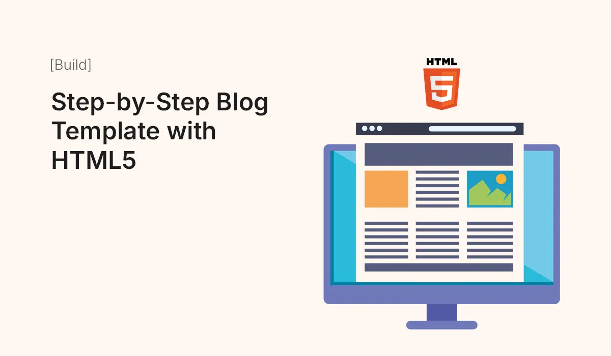
Creating a blog from scratch is a fantastic way to practice HTML5, CSS, and basic web design principles. A blog template provides the structure, layout, and styling you need, so you can focus on content and customization.
In this guide, we’ll show you how to build a blog template step-by-step using HTML5, including the main sections, styling tips, and best practices for modern blogging websites.
Why Build a Blog Template with HTML5
- Full Control Over Code – Customize every element to fit your style.
- Lightweight and Fast – No unnecessary CMS overhead.
- Learning Opportunity – Great for beginners to practice HTML5 semantics and CSS.
- Responsive Design – Learn how to structure content for desktops, tablets, and mobiles.
- SEO-Friendly – Semantic HTML5 improves search engine indexing.
Essential Sections of a Blog Template
- Header – Logo, site title, navigation menu.
- Hero Section – Featured post or welcome message.
- Blog Posts Section – List of posts with titles, excerpts, and “Read More” links.
- Sidebar (Optional) – Categories, recent posts, or social links.
- Footer – Copyright, contact info, and additional links.
Set Up Your Project
Create a project folder structure:
blog-template/
│
├── index.html
├── style.css
├── images/
└── scripts/
index.html– Main HTML file.style.css– CSS styling file.images/– Folder for post images or icons.scripts/– Optional folder for JavaScript.
Create the HTML Structure
<!DOCTYPE html>
<html lang="en">
<head>
<meta charset="UTF-8">
<meta name="viewport" content="width=device-width, initial-scale=1.0">
<title>My Blog</title>
<link rel="stylesheet" href="style.css">
</head>
<body>
<!-- Header -->
<header>
<h1>My Blog</h1>
<nav>
<ul>
<li><a href="#">Home</a></li>
<li><a href="#">About</a></li>
<li><a href="#">Contact</a></li>
</ul>
</nav>
</header>
<!-- Hero Section -->
<section class="hero">
<h2>Welcome to My Blog</h2>
<p>Sharing insights, tutorials, and tips about web development.</p>
</section>
<!-- Blog Posts Section -->
<main>
<section class="posts">
<article>
<img src="images/post1.jpg" alt="Post 1">
<h3>Post Title 1</h3>
<p>Post excerpt goes here...</p>
<a href="#">Read More</a>
</article>
<article>
<img src="images/post2.jpg" alt="Post 2">
<h3>Post Title 2</h3>
<p>Post excerpt goes here...</p>
<a href="#">Read More</a>
</article>
</section>
<!-- Sidebar -->
<aside>
<h3>Categories</h3>
<ul>
<li><a href="#">HTML</a></li>
<li><a href="#">CSS</a></li>
<li><a href="#">JavaScript</a></li>
</ul>
</aside>
</main>
<!-- Footer -->
<footer>
<p>© 2025 My Blog. All rights reserved.</p>
</footer>
</body>
</html>
Style with CSS
/* General Styles */
body {
  font-family: Arial, sans-serif;
  margin: 0;
  padding: 0;
  line-height: 1.6;
  background: #f9f9f9;
  color: #333;
}

/* Header */
header {
  background: #333;
  color: #fff;
  padding: 20px 0;
  text-align: center;
}

header nav ul {
  list-style: none;
  padding: 0;
}

header nav ul li {
  display: inline;
  margin: 0 15px;
}

header nav ul li a {
  color: #fff;
  text-decoration: none;
}

/* Hero Section */
.hero {
  background: #e2e2e2;
  text-align: center;
  padding: 50px 20px;
}

/* Blog Posts */
.posts {
  display: flex;
  flex-wrap: wrap;
  justify-content: space-around;
  max-width: 1000px;
  margin: 20px auto;
}

.posts article {
  background: #fff;
  margin: 10px;
  padding: 15px;
  border-radius: 8px;
  box-shadow: 0 2px 5px rgba(0,0,0,0.1);
  width: 45%;
}

.posts article img {
  max-width: 100%;
  border-radius: 5px;
}

/* Sidebar */
aside {
  max-width: 300px;
  margin: 20px auto;
  padding: 15px;
  background: #fff;
  border-radius: 8px;
}

/* Footer */
footer {
  text-align: center;
  padding: 20px 0;
  background: #333;
  color: #fff;
}

/* Responsive */
@media (max-width: 768px) {
  .posts {
    flex-direction: column;
    align-items: center;
  }

  .posts article {
    width: 90%;
  }
}
Make It Responsive
- Use flexbox or CSS Grid for post layout.
- Add media queries for mobile devices.
- Ensure navigation and sidebar collapse properly on smaller screens.
Customize Your Blog
- Replace placeholder images with your own.
- Update post titles and excerpts.
- Add links to full blog posts (if you plan multiple HTML pages).
- Change colors, fonts, and spacing in CSS to fit your style.
Optional Enhancements
- Search functionality using JavaScript.
- Comment section using third-party services like Disqus.
- Back-to-top button for easy navigation.
- Light/dark mode toggle with CSS variables and JS.
- Social media sharing buttons for each post.
Common Mistakes to Avoid
- Forgetting to use semantic HTML5 tags (
<header>,<article>,<aside>). - Not making the template responsive.
- Overloading pages with too many large images.
- Poor contrast or readability issues.
- Missing alt text for accessibility.
Conclusion
Building a blog template with HTML5 is a great learning exercise and a practical way to launch a simple, fast, and responsive blog. With this step-by-step template, you can:
- Practice HTML5 structure and semantic elements
- Learn CSS styling and responsive layouts
- Build a professional foundation for your personal blog
Start customizing today, add your posts, and make your blog live!
Create your first HTML5 blog template today! Customize it, add your content, and launch a fast, responsive blog in minutes.