Introduction
CSS Grid has completely transformed the way developers design modern web layouts. Unlike older techniques like floats or even Flexbox, CSS Grid allows you to create complex, responsive, and flexible layouts with minimal code.
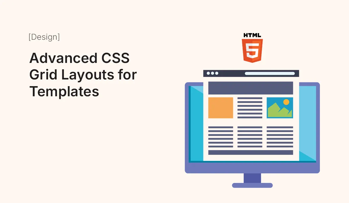
In this article, we’ll explore advanced CSS Grid layouts for HTML templates and show you how to use them effectively in multi-page and one-page website designs.
Why Use CSS Grid for Templates?
- Two-Dimensional Control – Works in both rows and columns simultaneously.
- Cleaner Code – Reduces the need for nested containers and extra markup.
- Responsive by Default – Easily adapt layouts with media queries.
- Flexible – Perfect for anything from simple landing pages to complex dashboards.
- Template-Friendly – Lets you define reusable layout structures.
Step 1: Basic CSS Grid Setup
.container {
  display: grid;
  grid-template-columns: 1fr 1fr 1fr;
  grid-gap: 20px;
}
display: grid;enables grid layout.grid-template-columns: 1fr 1fr 1fr;creates three equal-width columns.grid-gapdefines spacing between items.
Step 2: Creating a Responsive Layout
.container {
  display: grid;
  grid-template-columns: repeat(auto-fit, minmax(250px, 1fr));
  gap: 20px;
}
- Automatically adjusts column count based on available space.
- Ensures a minimum width of 250px per item.
- Perfect for responsive templates.
Step 3: Advanced Grid Areas
You can name areas to make layouts easier to manage.
.container {
  display: grid;
  grid-template-areas:
    "header header"
    "sidebar content"
    "footer footer";
  grid-template-columns: 200px 1fr;
  grid-template-rows: auto 1fr auto;
  gap: 20px;
}

header { grid-area: header; }
aside { grid-area: sidebar; }
main { grid-area: content; }
footer { grid-area: footer; }
This creates a classic template layout with a header, sidebar, content area, and footer.
Step 4: Nested Grids
You can place a grid inside another grid for more complex layouts.
.main-content {
  display: grid;
  grid-template-columns: 2fr 1fr;
  gap: 15px;
}
This allows multi-level layouts, perfect for blogs or dashboards.
Step 5: Responsive Grid with Media Queries
@media (max-width: 768px) {
  .container {
    grid-template-areas:
      "header"
      "content"
      "sidebar"
      "footer";
    grid-template-columns: 1fr;
  }
}
Reorganizes the layout on smaller screens to prioritize content.
Step 6: Advanced Use Cases
Portfolio Template
- Grid gallery with auto-adjusting columns.
- Hover effects for project previews.
Landing Page
- Hero section spanning multiple columns.
- Features section aligned in equal grid boxes.
Blog Template
- Sidebar on the left, content in the center, related posts on the right.
- Responsive collapse to single column on mobile.
E-Commerce Template
- Product grid with dynamic columns.
- Filter sidebar for categories and tags.
Best Practices for Advanced CSS Grid Layouts
- Use
minmax()for flexibility. - Combine Grid with Flexbox – Flexbox works better for small UI elements inside grid items.
- Plan Grid Areas – Sketch layout before coding.
- Keep Accessibility in Mind – Ensure logical reading order when rearranging areas.
- Optimize for Performance – Avoid overly complex nested grids.
Common Mistakes to Avoid
- Overusing fixed units instead of flexible ones.
- Forgetting fallback layouts for very old browsers.
- Ignoring spacing and alignment.
- Making layouts too complex for beginners to customize.
Conclusion
Advanced CSS Grid layouts allow you to build powerful, responsive, and template-friendly web designs with clean, minimal code. Whether you’re designing a portfolio, blog, landing page, or e-commerce template, mastering CSS Grid will help you create modern and professional layouts.
Start experimenting with advanced CSS Grid layouts today and make your HTML templates flexible, responsive, and visually stunning!