Introduction
Modern web experiences thrive on interactivity and motion. Whether it’s a smooth button hover, an elegant image transition, or a complex scrolling effect, animations can transform static HTML templates into engaging, memorable experiences.
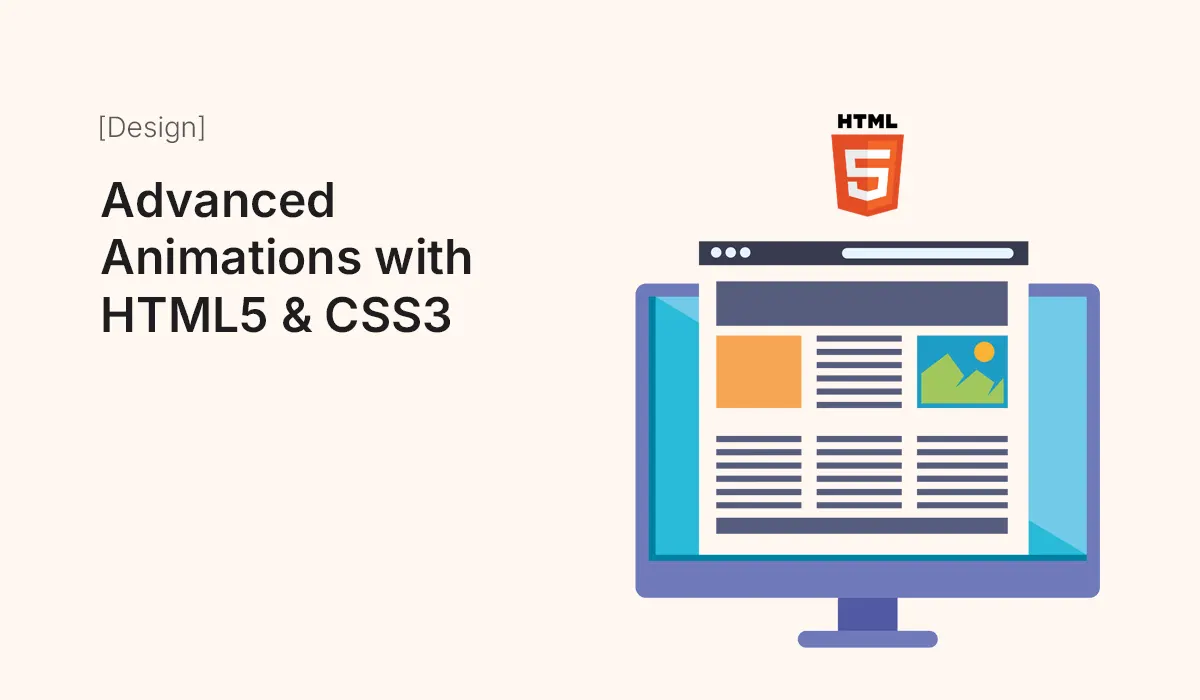
In this guide, we’ll dive deep into advanced animations with HTML5 and CSS3 — exploring the latest techniques, animation libraries, and optimization strategies to make your designs both beautiful and efficient.
The Power of Animation in Modern Web Design
Animation isn’t just eye candy — it’s functional. It helps:
- Guide users’ attention to important elements.
- Improve navigation flow with transitions and motion cues.
- Enhance storytelling and brand experience.
- Provide feedback (like button clicks or form submissions).
As of 2025, CSS3 and HTML5 provide native tools that make animations lightweight and device-friendly without relying heavily on JavaScript or external plugins.
Getting Started with HTML5 & CSS3 Animations
Before diving into complex effects, let’s understand the basics.
HTML5 Structure Example
<div class="box"></div>
CSS3 Animation Basics
.box {
  width: 100px;
  height: 100px;
  background: #4f46e5;
  position: relative;
  animation: moveBox 3s infinite alternate ease-in-out;
}

@keyframes moveBox {
  from {
    left: 0;
  }
  to {
    left: 200px;
  }
}
Here, @keyframes defines the animation, and animation applies it to the element. This simple setup forms the foundation for more advanced effects.
Advanced CSS3 Animation Techniques
Using Transform and Transition
CSS transforms (rotate, scale, skew, translate) are the backbone of smooth, hardware-accelerated animations.
button:hover {
  transform: scale(1.1) rotate(3deg);
  transition: transform 0.4s ease-in-out;
}
Tip: Combine transform with transition for performance-friendly hover effects.
Keyframe Animations for Complex Sequences
@keyframes bounce {
  0%, 100% { transform: translateY(0); }
  50% { transform: translateY(-30px); }
}

.bounce {
  animation: bounce 1s infinite;
}
You can control each stage of motion precisely using percentages — perfect for creating looping animations like bouncing logos or floating icons.
Using Animation Timing Functions
CSS3 provides several timing functions:
ease– smooth start and endease-in– slow start, fast finishease-out– fast start, slow finishcubic-bezier()– custom control for advanced easing
Example:
.box {
  animation-timing-function: cubic-bezier(0.68, -0.55, 0.27, 1.55);
}
Combining HTML5 + CSS3 for Realistic Effects
HTML5 adds semantic and structural capabilities, which, when paired with CSS3, can create dynamic interfaces.
Animated Hero Banner Example
<section class="hero">
  <h1 class="fade-in">Welcome to Our World</h1>
  <p class="slide-up">Crafted with HTML5 & CSS3</p>
</section>
.fade-in {
  animation: fadeIn 2s ease forwards;
}
.slide-up {
  animation: slideUp 2.5s ease forwards;
}

@keyframes fadeIn {
  from { opacity: 0; }
  to { opacity: 1; }
}
@keyframes slideUp {
  from { transform: translateY(50px); opacity: 0; }
  to { transform: translateY(0); opacity: 1; }
}
These combined animations create a professional, cinematic website entry.
CSS3 Animation Libraries
To speed up your workflow, use animation libraries that integrate easily with HTML templates:
| Library | Description | Use Case |
|---|---|---|
| Animate.css | Predefined CSS animations like bounce, fade, zoom | Quick UI animations |
| Hover.css | Button hover effects | Interactive buttons & icons |
| Magic Animations | Advanced transformations | Hero sections, loaders |
| AnimXYZ | Utility-based animation system | Responsive layouts |
Example using Animate.css:
<h2 class="animate__animated animate__fadeInUp">Our Services</h2>
Advanced Scroll Animations
With CSS scroll animations and Intersection Observer API, you can animate elements as users scroll.
Pure CSS Scroll Animation (Scroll-Timeline)
CSS Scroll-Linked Animations are now supported in modern browsers:
@scroll-timeline scrollAnim {
  source: auto;
  orientation: block;
}

.image {
  animation: zoomIn 1 linear both;
  animation-timeline: scrollAnim;
}

@keyframes zoomIn {
  0% { scale: 0.8; opacity: 0; }
  100% { scale: 1; opacity: 1; }
}
This technique creates subtle animations as elements enter the viewport — perfect for storytelling landing pages.
Creating Parallax Effects
Parallax scrolling gives your site depth and motion.
.parallax {
  background-image: url('mountains.jpg');
  background-attachment: fixed;
  background-size: cover;
  background-position: center;
  height: 100vh;
}
Adding layered divs with different scroll speeds produces immersive 3D-like motion.
Performance Optimization Tips
Animations can be resource-intensive. Follow these tips for better performance:
- Use
transformandopacityinstead oftoporleftfor smoother transitions. - Limit simultaneous animations.
- Prefer CSS animations over JavaScript where possible.
- Test performance with Chrome DevTools → Performance tab.
- Use will-change property for GPU acceleration:
.element { will-change: transform, opacity; }
Responsive Animations
Ensure animations scale and adapt across devices:
- Use
vw,vh, or%instead of fixed pixels. - Reduce or disable heavy effects for mobile devices.
- Use media queries to control animation duration or type.
Example:
@media (max-width: 768px) {
  .hero h1 {
    animation: fadeIn 1s ease forwards;
  }
}
Bonus: Combining CSS with SVG for Advanced Effects
SVGs allow vector-based animations for logos, icons, and illustrations.
Example:
<svg viewBox="0 0 100 100">
  <circle cx="50" cy="50" r="40" stroke="#4f46e5" stroke-width="5" fill="none" class="draw" />
</svg>
.draw {
  stroke-dasharray: 250;
  stroke-dashoffset: 250;
  animation: drawCircle 3s ease forwards;
}

@keyframes drawCircle {
  to { stroke-dashoffset: 0; }
}
This creates a “hand-drawn” logo animation effect — subtle yet elegant.
Conclusion
HTML5 and CSS3 have evolved to handle advanced animations with incredible precision and performance. From scroll effects to SVG strokes, you can bring your web templates to life without bloated scripts or slow load times.
When used thoughtfully, animations elevate user engagement, enhance storytelling, and give your design a professional edge.
Bring your web designs to life — master advanced animations with HTML5 & CSS3 today!