Best Free Figma Icon Packs
Introduction Icons are essential for UI design—they communicate meaning, guide users, and enhance usability. The right icon pack can save time, ensure consistency, and elevate your design. The good news? There are tons of free Figma icon packs crafted by the design community and open-source creators. In this guide, we’ll showcase the best free icon sets, how to use them effectively in Figma, and highlight useful insights from designers who’ve used them. Top Free Figma Icon Packs Worth Downloading Untitled UI Icons – 1,100+ Clean, Modern Icons Dencar Icon Pack – 500 Highly Flexible Icons Essential Icons – Minimalist & Purpose-Driven Ikonik – Massive Plugin-Based Library Material Design Icons Feather Icons IconPark Remix Icons, Tabler Icons, Phosphor Icons Universal Icon Set Streamline & UI Essentials (Via imagy.app) Community Insights on Icon Packs “1,100+ clean, consistent… picked up Product Hunt #1 Product of the Week and was retweeted 1,300x on Twitter.”“Dencar… 4 Types of icons… easy to quick search… size 24 px… variable stroke weight…”“100+ pixel-perfect, commonly used icons… free & Open Source.” Choosing the Right Icon Pack for Your Project Use Case Recommended Icon Packs Why It’s a Good Fit Modern, general UI Untitled UI Icons, Essential Icons Clean, structured, Figma-native Stylistic flexibility Dencar, Ikonik Multiple visual weights and massive libraries Standard platforms Material, Feather, Remix, Phosphor Universally recognized styles Custom/stylized needs IconPark, Universal, 7000 UI Icons Color and style variations included Tips to Use Icon Packs Effectively in Figma Conclusion Choosing the right icon pack can streamline your design workflow and elevate your UI—without spending a dime. Whether you prefer minimalist icons like Feather, a vast library like Ikonik, or a trusted Figma-native set like Untitled UI Icons, there’s an option tailored to your needs. Elevate your design spree—explore these Best Free Figma Icon Packs and add visual polish and clarity to your next project today!
Best Free Shopify Themes for Starters

Introduction Starting your first Shopify store can feel overwhelming — from setting up products to customizing layouts and managing apps. But one of the most important decisions you’ll make early on is choosing the right theme. Your theme dictates how your store looks, how customers navigate, and how smoothly they shop. While Shopify offers hundreds of premium themes, beginners often prefer free Shopify themes to keep costs low while learning the ropes. The good news? Shopify’s free themes are modern, mobile-friendly, and optimized for performance. In this guide, we’ll explore the best free Shopify themes for starters, highlight their features, and help you pick the right one for your business. Why Choose Free Shopify Themes as a Beginner? Before jumping into the list, here’s why free themes are a great starting point: actors to Consider Before Picking a Shopify Theme When choosing a theme, ask yourself: 👉 With this in mind, let’s look at the top free Shopify themes for beginners. Best Free Shopify Themes for Starters Dawn – Shopify’s Default Free Theme Best for: General stores, lifestyle brands, minimalists 👉 If you’re just starting, Dawn is Shopify’s go-to theme. It’s versatile enough for almost any niche. Craft – Storytelling and Artisanal Products Best for: Handmade goods, crafts, furniture, décor stores 👉 If your brand focuses on quality storytelling and artisan products, Craft is a great pick. Sense – Health and Beauty Best for: Beauty, wellness, and skincare brands 👉 For wellness and beauty startups, Sense offers a polished, trust-building design. Refresh – Bold and Vibrant Best for: Modern brands, bold visuals, and product launches 👉 If your brand is colorful, fun, and energetic, Refresh is a perfect fit. Ride – Sports and Outdoor Best for: Sports gear, activewear, and outdoor products 👉 Sports and outdoor stores benefit most from Ride due to its strong, dynamic appeal. Studio – Creative and Visual Brands Best for: Art, photography, portfolios, and small boutiques 👉 Perfect for creative entrepreneurs looking to highlight design, visuals, or curated collections. Taste – Food & Beverage Best for: Food brands, cafes, and beverages 👉 If you’re starting a coffee shop, organic brand, or food store, Taste captures the essence beautifully. Free vs. Paid Shopify Themes – What’s the Difference? 👉 Tip: Start with a free theme to validate your store idea. Upgrade later if you need advanced features. Tips for Customizing Free Shopify Themes Case Study: A Beginner Store Using Free Themes A small skincare startup launched with the Sense theme. They customized it with brand colors, optimized product images, and added testimonials. Within 3 months: 👉 Proof that free Shopify themes can be powerful when used correctly! Conclusion Starting your Shopify journey doesn’t mean you need to spend big on design. Shopify’s free themes like Dawn, Craft, Sense, Refresh, Ride, Studio, and Taste offer everything a beginner needs: mobile-friendly design, customization options, and professional layouts. The key is choosing the right theme for your niche and customizing it with your brand identity. Start small, test your store, and when your business grows, you can explore premium themes for advanced features. Remember: Your store’s success isn’t about how expensive your theme is — it’s about how well it connects with your customers. Ready to launch your store with one of the best free Shopify themes? Choose your favorite, customize it, and start selling today with confidence!
Joomla Templates for Nonprofits

Nonprofit organizations need websites that convey their mission, engage supporters, and encourage donations. Joomla, with its flexibility and robust template ecosystem, is an excellent choice for nonprofit websites. Using the right template can save time, provide essential features, and create a professional online presence. In this guide, we’ve curated a collection of Joomla templates specifically suited for nonprofits, charities, NGOs, and community organizations. Why Choose Joomla for Nonprofit Websites? Joomla is ideal for nonprofits because: With Joomla, nonprofits can build a professional website without the need for heavy coding. Tips for Selecting a Nonprofit Joomla Template Before choosing a template, consider: Choosing wisely ensures your website is functional, engaging, and visually appealing. Top Joomla Templates for Nonprofits JA Charity JoomShaper Helix Charity Template JD Boston Nonprofit Variation Vinaora NGO Template JSN Solid How to Customize Nonprofit Templates To make your nonprofit website stand out: Customizing templates ensures your site is engaging and aligned with your nonprofit’s mission. Essential Extensions for Nonprofit Websites Enhance functionality using Joomla extensions: These extensions help nonprofits interact with supporters and manage campaigns efficiently. Best Practices for Nonprofit Websites Following these practices increases engagement and encourages support. Conclusion Nonprofit Joomla templates provide a powerful starting point for creating a professional, responsive, and user-friendly website. Templates like JA Charity, Helix Charity, and JD Boston Nonprofit help organizations focus on their mission while offering essential features like donation integration, event management, and responsive layouts. By selecting the right template, customizing it, and leveraging Joomla extensions, nonprofits can build an online presence that engages supporters, promotes their cause, and drives donations. Explore these templates today and create a website that makes a real impact for your nonprofit organization. Create a professional online presence for your nonprofit! Explore these Joomla templates for nonprofits and start building a responsive, engaging, and donation-friendly website today.
Best Free Page Builders for WordPress
Building a professional-looking WordPress website no longer requires coding skills. Page builders allow you to design custom layouts using drag-and-drop editors, making it easy for beginners and experienced users alike. In this guide, we’ll explore the best free page builders for WordPress that help you create stunning websites effortlessly. Why Use a WordPress Page Builder Page builders are essential for: Pro Tip: Even with a free page builder, you can achieve professional results if you focus on clean design and usability. Elementor (Free Version) Overview: Elementor is one of the most popular page builders with a user-friendly interface. Key Features: Why It’s Great:The free version offers everything a beginner needs to create a modern, responsive website with ease. Download Beaver Builder (Lite) Overview: Beaver Builder Lite is a reliable drag-and-drop page builder for beginners. Key Features: Why It’s Great:It’s lightweight and beginner-friendly, ensuring your pages load quickly while being easy to design. Download Brizy (Free Version) Overview: Brizy is a visual editor with a focus on simplicity and speed. Key Features: Why It’s Great:Brizy is intuitive, making it ideal for beginners who want to design visually appealing pages quickly. Download SiteOrigin Page Builder Overview: SiteOrigin Page Builder is a classic, lightweight page builder plugin for WordPress. Key Features: Why It’s Great:It’s highly stable, lightweight, and ideal for users who want a simple, no-frills page builder. Download Gutenberg (Block Editor) Overview: Gutenberg is the default WordPress block editor, transforming WordPress into a simple page builder. Key Features: Why It’s Great:It’s built into WordPress, requires no extra installation, and is constantly improving with new features. Download Tips for Choosing the Right Free Page Builder Conclusion Free page builders like Elementor, Beaver Builder Lite, Brizy, SiteOrigin, and Gutenberg empower you to design professional WordPress websites without coding. By choosing the right builder for your needs, you can create visually appealing, responsive, and user-friendly pages quickly and efficiently. Start building stunning WordPress websites today! Choose from these free page builders for WordPress and design professional, responsive pages without any coding.
Best Minimalist HTML Templates for Beginners

Introduction Minimalist design focuses on simplicity, clean layouts, and clarity. For beginners learning HTML, using minimalist templates is a great way to start building websites without feeling overwhelmed by complex designs. In this guide, we’ll showcase some of the best minimalist HTML templates for beginners, why they’re effective, and tips for customizing them for your projects. Why Minimalist HTML Templates Are Ideal for Beginners Top Minimalist HTML Templates for Beginners Simple Blog Template by HTML5 UP Minimal Portfolio by Start Bootstrap Tidy Landing Page by Templated Clean Business Template by BootstrapMade Simple One-Page by Colorlib Lightweight Portfolio by Free CSS Templates Starter Landing Page by UIdeck Minimal Personal Website by One Page Love Basic HTML Template by Creative Tim Portfolio Starter by W3Layouts Tips for Customizing Minimalist HTML Templates Common Mistakes to Avoid Conclusion Minimalist HTML templates are perfect for beginners because they offer clarity, simplicity, and flexibility. They help you learn HTML, CSS, and responsive design while creating professional-looking websites. Choose one of these best minimalist HTML templates, start customizing, and build your first website with confidence. Download one of these minimalist HTML templates today and start building clean, responsive, and beginner-friendly websites!
Simple Tips for Faster Figma Workflow
Introduction Figma has become the go-to tool for designers in 2025 because of its collaborative features, speed, and intuitive interface. But even though Figma feels simple at first, many beginners (and even experienced designers) waste precious time by not using its built-in shortcuts, components, and workflow hacks. Whether you’re designing a website, mobile app, or dashboard, your workflow speed matters. Faster iterations mean more time for creativity and less frustration with repetitive tasks. In this post, we’ll explore simple, practical tips for a faster Figma workflow—so you can spend less time dragging pixels and more time designing polished, professional interfaces. Master Essential Shortcuts Keyboard shortcuts are the fastest way to boost productivity in Figma. Learn these first: Pro Tip: Print a shortcut cheat sheet or use Figma’s in-app “Keyboard Shortcuts” panel (Cmd/Ctrl + Shift + ?) until it becomes muscle memory. Use Auto Layout Everywhere Auto Layout is the secret weapon for speed. Instead of adjusting padding manually, let Auto Layout handle it. This is especially useful for lists, navigation bars, and form fields. Rely on Components and Variants Stop designing from scratch—convert repeated elements into components. This way, when you update a component (say, a button style), the change reflects across your entire design automatically. Apply Styles for Colors, Text, and Effects Consistency is a speed booster. Define: This way, you don’t waste time hunting for exact hex codes or font sizes. Plus, updates are one click away. Organize Layers and Pages Properly Messy files slow you down. Use Plugins to Automate Tasks Figma has thousands of plugins that cut design time drastically. Some must-try options: Instead of manually pasting data, let plugins do the heavy lifting. Use Quick Actions for Speed Hit Cmd/Ctrl + / to open Quick Actions. You can type any command (e.g., “Flip Horizontal”, “Outline Stroke”) instead of hunting through menus. This saves seconds per task—which adds up to hours per project. Duplicate Frames with Alt/Option + Drag Instead of copy-paste, use Alt/Option + Drag to duplicate frames instantly. This works beautifully when creating multiple screen flows or variations of a design. Apply Constraints for Responsive Design Stop resizing elements manually. Use Constraints to lock elements relative to their frame. This ensures your design scales properly across screen sizes without constant fixes. Use Component Properties Figma now allows properties like text content, boolean toggles, and instance swaps. This reduces the need for dozens of variants. It keeps your library small and manageable. Create Reusable Layout Grids Instead of setting grids manually each time, save them as reusable templates. This is especially helpful when designing multiple device sizes or sticking to an 8-point grid system. Use Version History Don’t waste time duplicating files for backups. Use File → Show Version History to restore or review older versions. Name key versions (e.g., “Homepage Final v1”) so you can revisit quickly. Keep a Personal UI Kit Save your commonly used buttons, cards, modals, and navigation bars in a personal kit. This way, every new project starts faster—you just drag-and-drop instead of recreating. Present Prototypes Smoothly Use Prototype Mode to link screens and show clients a clickable flow instead of static screens. This avoids long explanations and speeds up feedback cycles. Collaborate with Comments & Dev Mode Instead of endless Slack threads, leave comment pins directly in Figma. Developers can inspect sizes, spacing, and assets in Dev Mode, reducing handoff meetings and speeding production. Conclusion Designing in Figma doesn’t have to be slow or repetitive. By learning shortcuts, relying on Auto Layout, building reusable components, using plugins, and keeping your files organized, you’ll design faster and smarter. The key is to let Figma’s powerful features handle the tedious work so you can focus on creativity and problem-solving. Start applying these Figma workflow tips today and design faster, cleaner, and more confidently with every project.
Improving Shopify Store Speed

Introduction In eCommerce, every second counts. Research shows that 53% of mobile users leave a site if it takes more than 3 seconds to load. For Shopify store owners, this means speed isn’t just about user experience — it directly impacts sales, SEO rankings, and customer trust. A slow Shopify store can lead to: In this guide, we’ll dive deep into how to improve your Shopify store speed, covering common issues, optimization techniques, useful apps, and best practices. By the end, you’ll have a clear roadmap to make your Shopify store lightning fast. Why Shopify Store Speed Matters Conversions & Sales Amazon once reported that a 100-millisecond delay costs them 1% in sales. While your store isn’t Amazon, the principle holds true: faster stores = more sales. Search Engine Optimization (SEO) Google uses page speed as a ranking factor. A slow site means lower rankings, fewer visitors, and reduced visibility. Mobile Shoppers Over 70% of Shopify traffic comes from mobile. Mobile users are less patient, making speed optimization even more critical. User Experience & Trust A slow site feels unprofessional and makes customers doubt reliability. A fast store signals trust and efficiency. How to Check Shopify Store Speed Before optimizing, you need to know your baseline. Here are tools you can use: Tip: Run tests multiple times for accuracy. Common Reasons for Slow Shopify Stores Step-by-Step: How to Improve Shopify Store Speed Optimize Images Limit & Optimize Apps Every app adds scripts, CSS, and requests. Minify CSS & JavaScript Choose a Lightweight Theme Some premium Shopify themes come bloated with unnecessary features. Use a Content Delivery Network (CDN) Shopify already provides a CDN (powered by Fastly), but ensure your media and external scripts also use CDN when possible. Reduce Redirects & Broken Links Limit Custom Fonts Enable Lazy Loading & Preloading Optimize Checkout Experience Leverage AMP (Accelerated Mobile Pages) Though Shopify doesn’t support AMP natively, apps like AMP by Ampify Me can create AMP versions of product and blog pages for faster mobile performance. Advanced Speed Optimization Tips Best Shopify Apps for Speed Optimization Case Study: Speed Impact on Shopify Sales A fashion brand reduced homepage load time from 6.5s to 2.1s by: Result: 18% higher conversions and 22% lower bounce rate. Shopify Store Speed Checklist Conclusion Speed is one of the most underrated growth hacks for Shopify stores. A fast-loading store leads to better rankings, higher conversions, and a smoother shopping experience. The good news? You don’t need to be a developer to make big improvements. Start with image optimization, app audit, and theme cleanup — then move to advanced techniques like lazy loading and code minification. Ready to improve Shopify store speed? Start optimizing today and give your customers the fast, seamless shopping experience they deserve!
Speed Optimization for Joomla Beginners

Website speed is a critical factor for user experience, search engine rankings, and overall website success. Slow-loading websites frustrate visitors and can significantly reduce conversions. Joomla, while a powerful CMS, can become slow if not optimized properly. This guide will walk beginners through essential steps to speed up a Joomla website, from configuration tweaks to extensions and best practices. Why Website Speed Matters Optimizing your Joomla website’s speed is crucial because: For beginners, simple optimizations can drastically improve Joomla performance without technical complexity. Step 1: Choose a Fast Hosting Provider Your hosting environment impacts website speed: A reliable hosting provider with good server response times lays the foundation for a fast website. Step 2: Use a Lightweight Template Templates affect page load times: A lightweight template ensures your website loads quickly across devices. Step 3: Enable Joomla Caching Caching reduces server load and speeds up page delivery: Caching stores frequently accessed data, reducing page load time for repeat visitors. Step 4: Optimize Images Large images slow down websites significantly: Optimized images improve load times without sacrificing quality. Step 5: Minify CSS and JavaScript Reducing file sizes helps browsers load content faster: Minification decreases file sizes and improves site speed. Step 6: Use a Content Delivery Network (CDN) A CDN delivers your website content from servers closer to the user: CDNs are particularly useful if you have a global audience. Step 7: Optimize Joomla Database A clean database improves server response: A lean database enhances Joomla performance. Step 8: Enable GZIP Compression GZIP compresses files before sending them to browsers: Compressed files load faster, reducing bandwidth usage. Step 9: Limit the Use of Extensions and Modules Too many extensions or modules can slow your site: Streamlining your Joomla site reduces server load and improves speed. Step 10: Monitor Speed and Performance Regular monitoring helps maintain website speed: Continuous monitoring ensures your website remains fast and user-friendly. Conclusion Speed optimization is a crucial part of maintaining a successful Joomla website. By selecting fast hosting, using lightweight templates, enabling caching, optimizing images, and using tools like CDNs and GZIP compression, beginners can significantly improve website performance. Additionally, monitoring and maintaining your site ensures it remains fast as you add more content and functionality. Start optimizing your Joomla website today to deliver a seamless, fast-loading experience for your visitors and improve your search engine rankings. Boost your Joomla website performance today! Follow this Joomla speed optimization guide to improve loading times, enhance user experience, and rank higher in search engines.
Speed Up WordPress in Simple Steps
Website speed is crucial for user experience, search engine rankings, and overall website success. A slow WordPress site can lead to high bounce rates and lost visitors. The good news is, speeding up WordPress is simple with the right strategies. In this guide, we’ll walk you through easy steps to optimize your WordPress site for speed. Why Speed Matters for WordPress Sites Step 1: Choose a Fast and Lightweight Theme The theme you choose impacts your site speed: Pro Tip: Minimalist designs often load faster due to fewer elements and scripts. Step 2: Use a Caching Plugin Caching reduces server load and speeds up page delivery: Step 3: Optimize Images Large images are a common cause of slow websites: Step 4: Minify CSS, JavaScript, and HTML Minification removes unnecessary spaces and comments: Pro Tip: Test your site after minifying to ensure it works correctly. Step 5: Use a Content Delivery Network (CDN) A CDN stores your website files on multiple servers worldwide: Step 6: Optimize Your Database A cluttered database slows down your website: Step 7: Limit Plugins and External Scripts Too many plugins or scripts can affect site speed: Step 8: Enable Lazy Loading Lazy loading ensures images and videos load only when visible on the screen: Pro Tip: Lazy loading reduces initial page load time and improves Core Web Vitals scores. Step 9: Choose a Reliable Hosting Provider Your hosting affects speed significantly: Step 10: Test Your Website Speed Regularly Conclusion Speeding up WordPress doesn’t have to be complicated. By following these simple steps—choosing a fast theme, caching, optimizing images, using a CDN, and limiting unnecessary plugins—you can significantly improve your website’s performance. A faster site not only enhances user experience but also boosts SEO and engagement. Start optimizing today! Follow these simple steps to speed up WordPress and create a fast, user-friendly, and SEO-ready website for your visitors.
Making HTML Templates Mobile-Friendly
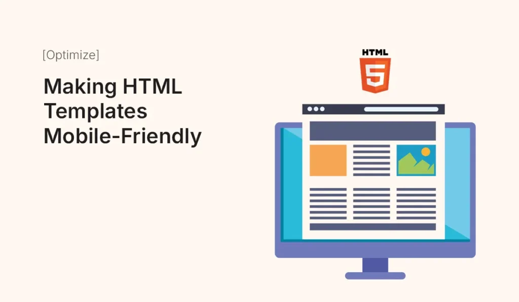
Introduction In 2025, mobile traffic dominates the web. Google’s mobile-first indexing makes it clear: if your HTML templates aren’t mobile-friendly, your website may lose traffic and rankings. This guide shows you how to make HTML templates fully responsive and mobile-friendly, covering best practices, common pitfalls, and techniques to ensure your site looks great on all devices. Why Mobile-Friendly HTML Templates Matter Use the Viewport Meta Tag The viewport meta tag tells browsers how to scale and render your site on mobile devices. Tips: Choose a Responsive Layout Media Queries Media queries let you apply CSS rules based on screen size. Tips: Flexible Images and Media Optimize Typography Simplify Navigation Reduce Page Load for Mobile Test Across Devices Common Mistakes to Avoid Conclusion Making your HTML templates mobile-friendly is no longer optional—it’s essential. By implementing responsive layouts, flexible media, media queries, and mobile-optimized typography, your site will look great on any device and perform better in search engines. Start optimizing your templates today and ensure your website provides a seamless experience for every visitor, on every screen. Optimize your HTML templates for mobile today! Make your website responsive, fast, and user-friendly to attract more visitors and boost your SEO.