Interactive Prototypes with Smart Animate
Introduction Prototyping is one of the most powerful features in Figma—it allows designers to transform static screens into interactive experiences. Among Figma’s prototyping tools, Smart Animate stands out as a game-changer. It lets you create smooth, natural transitions between frames by automatically animating the differences between them. Whether you’re designing a mobile app, web dashboard, or interactive landing page, Smart Animate helps you test and showcase ideas that feel like the real product. In this guide, we’ll explore how to use Smart Animate effectively and how to build engaging interactive prototypes in Figma. What is Smart Animate? Smart Animate is a prototyping feature in Figma that automatically animates changes between two frames. Instead of hard-cut transitions, it: Example: A button can smoothly expand into a card when clicked, or a sidebar can slide in naturally. Why Use Smart Animate? Setting Up Smart Animate in Figma I: Prepare Frames II: Create Components (Optional but Recommended) III: Add Prototype Connections IV: Choose Animation V: Preview & Test Examples of Interactive Prototypes with Smart Animate Tips for Better Smart Animate Prototypes Common Mistakes to Avoid Conclusion Figma’s Smart Animate feature makes it easy to create interactive prototypes that feel polished, engaging, and realistic. By mastering Smart Animate, you can communicate design intent clearly, improve collaboration with developers, and impress clients or stakeholders with near real-life product flows. Bring your designs to life—start building Interactive Prototypes with Smart Animate in Figma today and create experiences that truly impress.
Setting Up Shopify Collections & Filters
Introduction When running an online store, product organization is everything. Imagine walking into a physical store where items are scattered randomly — frustrating, right? The same applies to e-commerce. On Shopify, Collections and Filters are the key tools that make your store easy to navigate. They help shoppers quickly find what they want, improve the browsing experience, and increase conversions. In this guide, we’ll cover how to set up Shopify collections and filters step by step, along with best practices to organize your products effectively. What Are Shopify Collections? Collections in Shopify are groups of products that share common features or purposes. They work like “categories” in a traditional store. Types of Shopify Collections Example: A clothing store can create collections like Men’s Wear, Women’s Wear, New Arrivals, Sale Items, etc. What Are Shopify Filters? Filters (also known as faceted search) allow customers to refine results within a collection or search page. Common filter options include: Example: In a “Shoes” collection, filters let shoppers refine by size 9, black color, under $100. Benefits of Collections & Filters Step 1: Creating Shopify Collections Example Setup Step 2: Organizing Products with Tags Tags are essential for managing collections and filters. Example: Products tagged with “sale” automatically appear in the “Sale” collection. Step 3: Displaying Collections in Your Store Step 4: Enabling Shopify Filters As of Shopify’s Online Store 2.0, you can set up native filters without extra apps. How to Enable Filters Example: For a “Jackets” collection, you can enable filters for Size, Color, Price Range. Step 5: Using Metafields for Advanced Filters Metafields let you add custom product data (e.g., fabric type, care instructions, material). This allows for unique, industry-specific filters beyond standard options. Step 6: Filter & Collection Apps (For Advanced Needs) While Shopify’s built-in filters are great, apps give more flexibility. Recommended for stores with thousands of products. Step 7: SEO Optimization for Collections Collections often rank for high-traffic keywords. Optimize them like landing pages: Example: Collection “Running Shoes” could target keywords like best men’s running shoes online. Step 8: Best Practices for Collections & Filters Common Mistakes to Avoid Conclusion Setting up Shopify collections and filters is not just about organizing products — it’s about improving customer experience, boosting SEO, and driving conversions. A well-structured store makes it easy for shoppers to find what they need, reducing frustration and increasing sales. Whether you’re running a small boutique or a large catalog, collections and filters are the backbone of an effective Shopify store. Start small with manual collections, tags, and basic filters. As your store grows, leverage automation, metafields, and advanced filtering apps. Ready to improve your store’s navigation? Start setting up Shopify collections & filters today and make shopping easier while boosting conversions!
Creating Multilingual Joomla Websites
Joomla is one of the most popular CMS platforms for building multilingual websites. Unlike many other systems, Joomla comes with built-in multilingual support, meaning you don’t need third-party plugins to create a website in multiple languages. This makes Joomla an excellent choice for businesses, bloggers, and organizations looking to reach audiences worldwide. In this guide, we’ll walk you through the process of creating a multilingual Joomla website, covering everything from initial setup to advanced customization. Why Build a Multilingual Joomla Website? Before we dive into the “how,” let’s look at the “why.” Step 1: Prepare Your Joomla Site Before enabling multiple languages, make sure: Step 2: Install Additional Languages Repeat the process for all the languages you need. Step 3: Enable Language Content Once installed: This makes them available for menus, modules, and content. Step 4: Set Up Language Switcher A language switcher allows users to change the website language easily. Now visitors can switch languages directly from your site’s navigation. Step 5: Configure Multilingual Menus Each language requires its own menu: Pro Tip: Set up a default homepage for every language, so Joomla knows where to redirect users. Step 6: Create Multilingual Content Now, you can start creating pages for different languages: Repeat this process for all your pages and translations. Step 7: Use Associations for Easy Switching Joomla allows you to associate articles and menus between languages. For example: To set this up: This creates a seamless user experience. Step 8: Multilingual Modules Modules also need translations. For example, a contact form or footer. This ensures each version of your site feels complete and consistent. Step 9: Optimize SEO for Multilingual Joomla SEO is crucial for multilingual sites. Follow these best practices: Step 10: Test & Maintain Once your multilingual site is live: Advanced Tips Conclusion Creating a multilingual Joomla website may seem complex at first, but with Joomla’s built-in tools, the process is straightforward. By installing languages, setting up menus, configuring a language switcher, and optimizing for SEO, you can deliver a seamless, localized experience to your audience. Whether you’re running a business, nonprofit, or blog, a multilingual Joomla site helps you connect with people worldwide—boosting visibility, trust, and growth. Start building your multilingual Joomla website today and reach a global audience with localized content and seamless navigation!
Adding WooCommerce to WordPress Sites
If you want to turn your WordPress website into a fully functional online store, WooCommerce is the go-to solution. Powering over 5 million active stores worldwide, WooCommerce offers everything you need to sell products and services online — from product management to secure payments. In this guide, we’ll walk through how to add WooCommerce to WordPress sites step by step, along with setup tips, customization options, and best practices for running a successful online shop. Why Choose WooCommerce for WordPress? Prerequisites Before Installing WooCommerce Before you start, make sure you have: Step 1: Install WooCommerce Plugin Once activated, WooCommerce launches a setup wizard to guide you through the basics. Step 2: Run the Setup Wizard The setup wizard asks for key details: Step 3: Add Products WooCommerce allows you to sell both physical and digital products. Step 4: Configure Payments WooCommerce supports multiple payment gateways out of the box. You can also add more gateways through plugins. Step 5: Set Up Shipping Shipping configuration is crucial for physical products. Step 6: Configure Tax Settings If you need to collect taxes: WooCommerce also integrates with tax calculation services like Avalara and TaxJar. Step 7: Customize Store Design Your store’s design impacts user experience and conversions. Step 8: Install Essential WooCommerce Plugins To enhance your store, consider adding: Step 9: Test Your Store Before launching: Step 10: Launch Your Store Once everything is tested: Tips for Running a Successful WooCommerce Store Common WooCommerce Mistakes to Avoid Conclusion Adding WooCommerce to your WordPress site is the easiest way to start selling products online. With its flexibility, scalability, and extensive plugin ecosystem, WooCommerce empowers anyone — from beginners to experienced developers — to build a professional online store. By following the steps in this guide, you can set up, customize, and launch your WooCommerce store with confidence. Start adding WooCommerce to WordPress today and transform your website into a powerful online store!
Adding JavaScript Interactivity to HTML Templates
Introduction While HTML provides structure and CSS adds style, JavaScript brings interactivity to web templates. Whether you’re building a portfolio, business site, or landing page, adding JavaScript enhances the user experience with animations, dynamic elements, and real-time updates. In this guide, we’ll walk through how to add JavaScript interactivity to HTML templates, including examples, best practices, and common features. Why Add JavaScript to HTML Templates? Step 1: Linking JavaScript to Your HTML Template Add a JavaScript file at the bottom of your HTML before </body>: Or write inline scripts for small features: Step 2: Adding Simple Interactivity Example 1: Toggle Navigation Menu Step 3: Adding Sliders and Carousels Use JavaScript for image sliders: Step 4: Smooth Scrolling Navigation This makes anchor links scroll smoothly instead of jumping. Step 5: Form Validation Step 6: Modal Popups Step 7: Advanced Interactivity with Libraries Using libraries saves time and adds polished effects. Best Practices for Adding JavaScript Common Mistakes to Avoid Conclusion JavaScript takes HTML templates from static to interactive, making them engaging, functional, and professional. From simple menus to advanced sliders and animations, you can enhance user experience with just a few lines of code. Start adding JavaScript interactivity to your HTML templates today and create websites that are dynamic, engaging, and user-friendly!
Advanced UI Layouts with Auto Layout
Introduction Designing user interfaces in Figma becomes a whole lot easier with Auto Layout. Originally introduced to help designers quickly adjust buttons and forms, Auto Layout has evolved into a powerful tool for building advanced UI layouts. Whether you’re designing a landing page, dashboard, or mobile app, Auto Layout helps you create dynamic, responsive, and scalable components. In this guide, we’ll explore how to go beyond the basics and master advanced UI layouts with Auto Layout in Figma. Why Use Auto Layout? Before diving into advanced techniques, let’s recap why Auto Layout is so powerful: Auto Layout Basics Recap If you’re new to Auto Layout, master these first before moving into advanced layouts. Advanced Auto Layout Techniques Nested Auto Layouts Dynamic Buttons with Variants Responsive Navigation Bars Complex Grid Layouts Sticky Headers and Footers Form Layouts Adaptive Cards & Widgets Alignment Tricks Pro Tips for Mastering Auto Layout Example: Building a Dashboard with Auto Layout This modular approach lets you scale and rearrange without breaking the design. Common Mistakes to Avoid Conclusion Mastering Advanced UI Layouts with Auto Layout unlocks a new level of efficiency and creativity in Figma. From responsive dashboards to adaptive forms, Auto Layout ensures your designs are consistent, scalable, and developer-friendly. The more you practice, the more you’ll see Auto Layout as a design system superpower—not just a layout tool. Supercharge your design process—start building Advanced UI Layouts with Auto Layout in Figma today and create responsive, scalable designs with ease.
How to Customize Shopify Checkout Pages
Introduction The checkout page is the final and most important step in your customer’s shopping journey. No matter how great your products, branding, or marketing are, if your checkout page isn’t optimized, customers may abandon their carts. By default, Shopify offers a clean and functional checkout experience. However, to maximize conversions, trust, and brand consistency, you should customize Shopify checkout pages to match your store’s style and customer expectations. This guide will show you how to customize Shopify checkout pages, what options are available, the limitations, and the best practices to boost your store’s revenue. Why Customize Shopify Checkout Pages? Here’s why checkout customization is essential for every Shopify store owner: Shopify Checkout Customization Options Shopify offers different levels of checkout customization depending on your plan. If you’re not on Shopify Plus, customization is limited to design and apps. Step 1: Customizing Checkout Design (Theme Editor) Best Practices for Checkout Branding Step 2: Adding Custom Fields Sometimes you may need extra information (gift notes, delivery instructions, tax ID, etc.). Ways to add custom fields: Example: Add a “Gift Message” field for personalized notes. Step 3: Editing Checkout Language You can change text labels at checkout to better match your brand’s tone. Example: Instead of “Complete Order,” use “Place My Order Securely.” Step 4: Upselling & Cross-Selling at Checkout Boost sales by suggesting additional products at checkout. Options include: Example: If a customer buys shoes, suggest matching socks at checkout. Step 5: Checkout Scripts (Shopify Plus Only) Shopify Plus users can use Scripts Editor to customize checkout logic. Example: Give free shipping if cart value exceeds $100. Step 6: Checkout Apps & Tools Here are some top Shopify checkout customization apps: Step 7: Testing Your Checkout Before going live, test your checkout flow: Step 8: Best Practices for Checkout Optimization Limitations of Shopify Checkout Customization If checkout flexibility is critical, consider upgrading to Shopify Plus. Conclusion Your checkout page is where your sales are won or lost. While Shopify provides a great default checkout, customizing it helps you build trust, strengthen branding, and boost conversions. From simple branding tweaks to advanced upselling strategies with Shopify Plus, you can tailor the checkout process to fit your business needs. Remember: a well-optimized checkout page = fewer abandoned carts and higher revenue. Want to boost conversions and sales? Start today and customize Shopify checkout pages to create a seamless, branded, and high-performing customer experience!
Advanced Joomla Template Customization
Joomla is one of the most flexible CMS platforms available, and its true power lies in the ability to fully customize templates. While beginner users may stick to simple color and font changes, advanced Joomla template customization allows you to create a unique website tailored exactly to your brand or project requirements. In this guide, we’ll explore advanced customization techniques for Joomla templates, covering overrides, custom CSS, framework tools, and more. Why Go Beyond Basic Template Customization? Basic customization—such as updating logos, adjusting menus, or changing colors—is enough for small projects. But for businesses, agencies, or professionals who want a distinct online presence, advanced customization ensures: Step 1: Use Template Overrides One of Joomla’s most powerful features is template overrides. This allows you to customize output for articles, categories, menus, or modules—while still being safe during Joomla updates. Step 2: Add Custom CSS & SCSS While templates come with their own stylesheets, adding a custom.css file keeps your changes organized. Some advanced frameworks like Helix Ultimate also support SCSS, letting you use variables, mixins, and modular styles for more maintainable code. Step 3: Leverage Joomla Template Frameworks Frameworks like Helix Ultimate, Gantry, and T4 Framework give advanced customization options: Using frameworks speeds up customization while keeping flexibility intact. Step 4: Customize Module Positions Every Joomla template comes with predefined module positions—areas where you can place menus, banners, or widgets. Advanced users can: This gives you complete control over how content is displayed. Step 5: Modify Template PHP Files For deeper customization, editing template PHP files may be necessary. Examples include: Tip: Always use a child template or keep backups before editing PHP files directly. Step 6: Use Advanced Menu Styling Navigation plays a huge role in design. With advanced customization, you can: Frameworks like Helix Ultimate make mega menus simple to configure. Step 7: Enhance with JavaScript & Animations To create engaging experiences: These enhancements improve interactivity without overloading your site. Step 8: Optimize for Performance Advanced customization should never slow your site. Follow these tips: A fast-loading customized template improves both SEO and user satisfaction. Step 9: Multilingual Customization Joomla is multilingual by default, but template customization can enhance this: This is especially important for global businesses. Step 10: Test & Document Customizations Finally, always: Proper testing ensures your advanced template remains stable long-term. Conclusion Advanced Joomla template customization unlocks the full potential of your website. By using overrides, custom CSS, frameworks, and advanced layout adjustments, you can design a site that is unique, user-friendly, and aligned with your brand. Whether you’re building for business, e-commerce, or personal projects, Joomla provides the flexibility and control you need. Take your Joomla site beyond the basics—explore these customization techniques and create a truly standout website. Transform your website with advanced Joomla template customization—unlock flexibility, performance, and unique design possibilities today!
How to Customize WordPress Headers & Footers
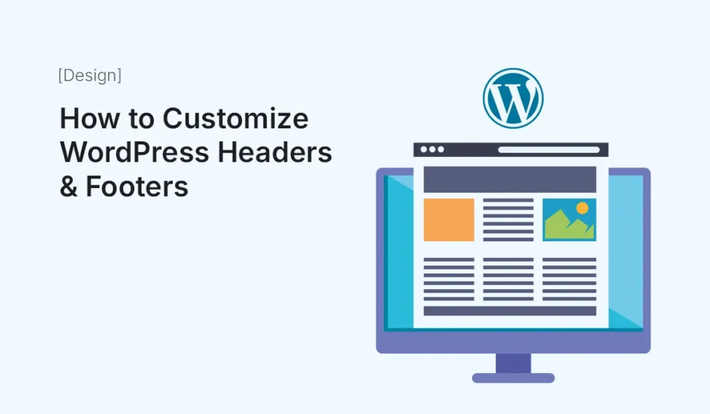
When it comes to website design, your header and footer play a critical role. The header is usually the first thing visitors notice, while the footer is the last impression before they leave your site. Customizing both areas is essential for creating a unique brand identity and improving user experience. In this guide, we’ll explore how to customize WordPress headers and footers step by step — from using built-in theme options and page builders to coding advanced customizations. Why Customize Headers & Footers? Your default theme’s header and footer might look generic. Customization allows you to: Different Ways to Customize Headers & Footers in WordPress There are multiple methods depending on your skill level and tools. Customize Using the WordPress Customizer Best For: Beginners using free or premium themes. Limitations: Not all themes allow full customization. Some restrict layout or design changes. Use a Page Builder Plugin Best For: Beginners and intermediates who want design freedom without coding. Popular plugins: Steps with Elementor Pro: Advantages: Use a Theme with a Built-in Header & Footer Builder Many modern WordPress themes now include header & footer builders, even in free versions. Examples: Benefits: Add Widgets to Footer Most themes allow widget areas in the footer. Steps: Use Custom Code (Advanced Method) For developers, editing header.php and footer.php files allows complete control. Steps: Example – Add Custom Text to Footer: Warning: Only attempt if you’re comfortable with PHP and WordPress theme structure. Add Sticky or Transparent Headers Sticky headers keep navigation visible while scrolling, improving UX. Transparent headers let your hero image show behind the navigation for a modern look. Ways to add: Use Plugins for Extra Features If your theme doesn’t support custom headers/footers, try plugins: Best Practices for Designing Headers & Footers Examples of Effective Headers Examples of Effective Footers Conclusion Customizing headers and footers in WordPress is crucial for creating a professional, user-friendly website. Whether you use the Customizer, page builders, theme options, or custom code, you have plenty of ways to design unique headers and footers that reflect your brand and improve user engagement. Start small with your theme’s built-in options, and when you’re ready, move on to page builders or custom coding for more flexibility. Take control of your website design — start today and customize WordPress headers & footers to create a unique, professional brand experience.
Advanced CSS Grid Layouts for Templates
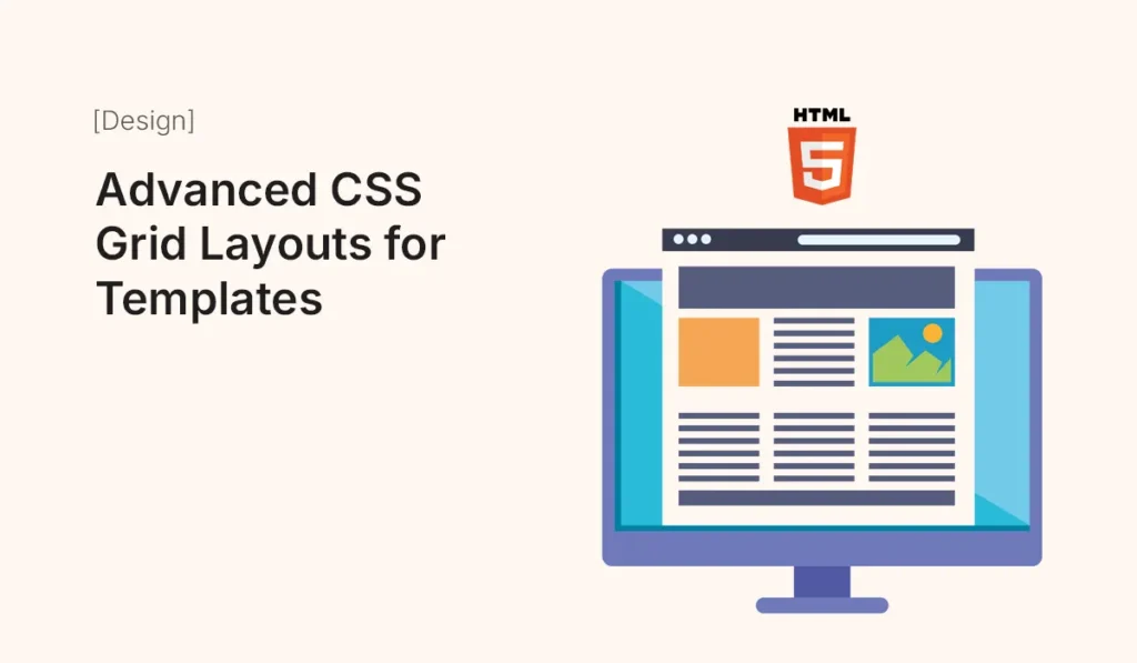
Introduction CSS Grid has completely transformed the way developers design modern web layouts. Unlike older techniques like floats or even Flexbox, CSS Grid allows you to create complex, responsive, and flexible layouts with minimal code. In this article, we’ll explore advanced CSS Grid layouts for HTML templates and show you how to use them effectively in multi-page and one-page website designs. Why Use CSS Grid for Templates? Step 1: Basic CSS Grid Setup Step 2: Creating a Responsive Layout Step 3: Advanced Grid Areas You can name areas to make layouts easier to manage. This creates a classic template layout with a header, sidebar, content area, and footer. Step 4: Nested Grids You can place a grid inside another grid for more complex layouts. This allows multi-level layouts, perfect for blogs or dashboards. Step 5: Responsive Grid with Media Queries Reorganizes the layout on smaller screens to prioritize content. Step 6: Advanced Use Cases Portfolio Template Landing Page Blog Template E-Commerce Template Best Practices for Advanced CSS Grid Layouts Common Mistakes to Avoid Conclusion Advanced CSS Grid layouts allow you to build powerful, responsive, and template-friendly web designs with clean, minimal code. Whether you’re designing a portfolio, blog, landing page, or e-commerce template, mastering CSS Grid will help you create modern and professional layouts. Start experimenting with advanced CSS Grid layouts today and make your HTML templates flexible, responsive, and visually stunning!