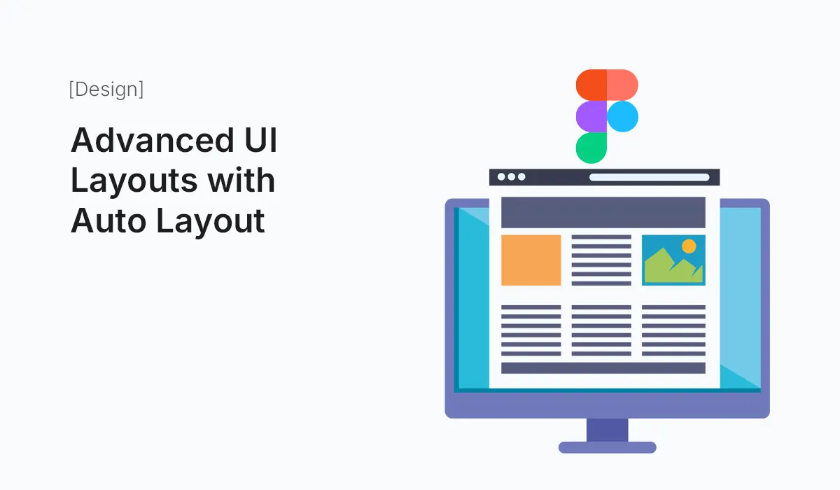
Introduction
Designing user interfaces in Figma becomes a whole lot easier with Auto Layout. Originally introduced to help designers quickly adjust buttons and forms, Auto Layout has evolved into a powerful tool for building advanced UI layouts.
Whether you’re designing a landing page, dashboard, or mobile app, Auto Layout helps you create dynamic, responsive, and scalable components. In this guide, we’ll explore how to go beyond the basics and master advanced UI layouts with Auto Layout in Figma.
Why Use Auto Layout?
Before diving into advanced techniques, let’s recap why Auto Layout is so powerful:
- Responsiveness: Adapts automatically to content size and screen variations.
- Consistency: Maintains alignment and spacing across components.
- Scalability: Easily handle complex designs without breaking layouts.
- Efficiency: Save time by reducing manual adjustments.
Auto Layout Basics Recap
- Direction: Vertical or horizontal stacking.
- Spacing: Define gaps between elements.
- Padding: Control inner spacing inside a container.
- Resizing: Set fixed, hug, or fill container behaviors.
If you’re new to Auto Layout, master these first before moving into advanced layouts.
Advanced Auto Layout Techniques
Nested Auto Layouts
- Combine multiple Auto Layout frames inside one another.
- Example: A card component → contains text + icon + button, each managed with Auto Layout.
Dynamic Buttons with Variants
- Create buttons that expand with text length.
- Use Auto Layout + Variants for hover, focus, and disabled states.
Responsive Navigation Bars
- Use horizontal Auto Layout with equal spacing.
- Add “fill container” resizing for flexible width items.
- Combine icons + text that adjust for mobile or desktop views.
Complex Grid Layouts
- Simulate multi-column grids using nested Auto Layout frames.
- Example: Dashboard layout with sidebar, main content, and widgets.
Sticky Headers and Footers
- Build fixed-position headers/footers by placing them in dedicated Auto Layout frames.
- Combine with vertical scrollable content.
Form Layouts
- Stack labels, input fields, and error messages using vertical Auto Layout.
- Add spacing tokens for consistent padding.
Adaptive Cards & Widgets
- Use Auto Layout to make dashboard widgets resize dynamically.
- Cards should expand with content without breaking alignment.
Alignment Tricks
- Mix alignment rules inside one Auto Layout (e.g., top-left for icons, right-aligned buttons).
- Useful for toolbars and dialog boxes.
Pro Tips for Mastering Auto Layout
- Use Spacing Tokens
- Define consistent spacing values (8px, 16px, 24px).
- Keeps layouts predictable.
- Combine with Constraints
- Auto Layout + constraints make elements scale properly across screens.
- Leverage “Distribute Space”
- Perfect for equal spacing between navigation items.
- Name Frames Clearly
- Helps when nesting multiple Auto Layout frames.
- Preview Responsiveness
- Resize frames frequently to check adaptability.
Example: Building a Dashboard with Auto Layout
- Sidebar – Vertical Auto Layout with icons + labels.
- Header – Horizontal Auto Layout with logo left, profile right.
- Main Content – Nested Auto Layout for cards, charts, and tables.
- Footer – Horizontal Auto Layout with equal spacing.
This modular approach lets you scale and rearrange without breaking the design.
Common Mistakes to Avoid
- Over-nesting – Too many layers slow down performance.
- Mixing inconsistent spacing – Stick to spacing tokens.
- Forgetting variants – Use them for states instead of duplicating components.
Conclusion
Mastering Advanced UI Layouts with Auto Layout unlocks a new level of efficiency and creativity in Figma. From responsive dashboards to adaptive forms, Auto Layout ensures your designs are consistent, scalable, and developer-friendly.
The more you practice, the more you’ll see Auto Layout as a design system superpower—not just a layout tool.
Supercharge your design process—start building Advanced UI Layouts with Auto Layout in Figma today and create responsive, scalable designs with ease.