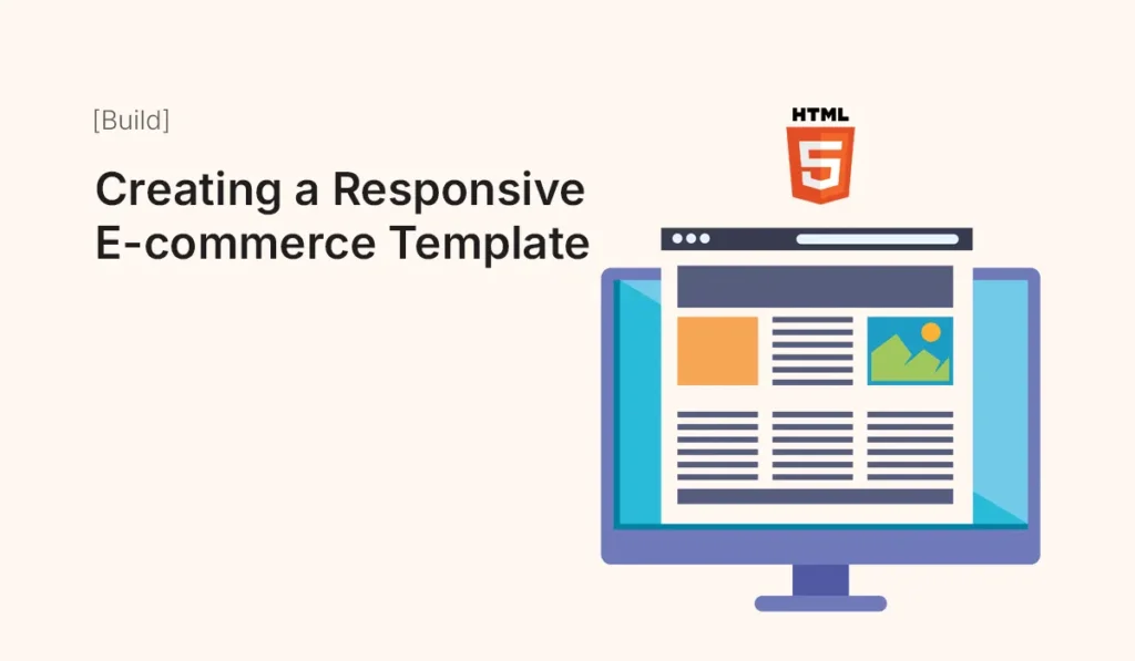
Creating a Responsive E-commerce Template
Introduction In today’s competitive digital marketplace, having a responsive e-commerce website is no longer optional — it’s essential. Customers expect seamless shopping experiences across desktops, tablets, and mobile devices. Creating a responsive e-commerce template using HTML, CSS, and modern layout techniques allows you to build fast, scalable, and visually appealing online stores without relying entirely on heavy frameworks or CMS platforms. In this comprehensive guide, you’ll learn how to build a responsive e-commerce template from scratch, including layout structure, product grids, responsiveness, and optimization techniques. What Makes an E-commerce Template Responsive? A responsive e-commerce template automatically adapts to different screen sizes and devices, ensuring usability and accessibility. Key Elements of Responsiveness A well-designed template ensures users can browse products, add items to cart, and checkout effortlessly — regardless of device. Planning Your E-commerce Template Structure Before coding, define the structure of your template. Essential Sections Basic HTML Structure Start with a clean HTML5 boilerplate: Styling with CSS for Layout and Design Use Flexbox and Grid to create responsive layouts. Making the Template Responsive Use media queries to adapt layouts for smaller devices. Mobile Optimization Tips Building a Product Grid System A product grid is the core of any e-commerce template. Example Product Card Enhancements Adding Interactivity with JavaScript Enhance user experience with basic interactivity. You can expand this into: Optimizing Performance for E-commerce Templates Performance directly impacts conversions. Best Practices SEO Tips for E-commerce HTML Templates To rank higher in search engines: Advanced Features to Consider As your template grows, you can add: Tools to Speed Up Development Conclusion Creating a responsive e-commerce template using HTML gives you full control over design, performance, and scalability. With the right structure, responsive layout, and optimization strategies, you can build a professional online store that delivers a seamless shopping experience across all devices. Whether you’re launching a startup store or building templates for clients, mastering this skill will help you create fast, user-friendly, and conversion-focused e-commerce websites. Start building your online store today with “Creating a Responsive E-commerce Template” and deliver a seamless shopping experience across all devices!